How Do You Pantone Match for Embroidery?
Get an inside look at how we use Pantone matching for embroidery—and why it's so dang important.

What is Pantone color matching?
The magical world of color communication can be pretty daunting. With so many options in shades and differences in interpretation, accurate and consistent communication is critical.
Basic color theory and brand philosophy tell us that color can communicate a lot—from emotion, to values, to simply building consistency. So, while it may seem like a silly issue, the world of color matching and consistent color communication is actually kind of make-or-break.
Luckily, Pantone offers a system that enables anyone to narrow down their desired color to a specific shade—and then communicate it in a language that works across the world.

Pantone’s color systems
As far as color matching goes, Pantone has 2 systems in place, each relevant to different needs and materials.
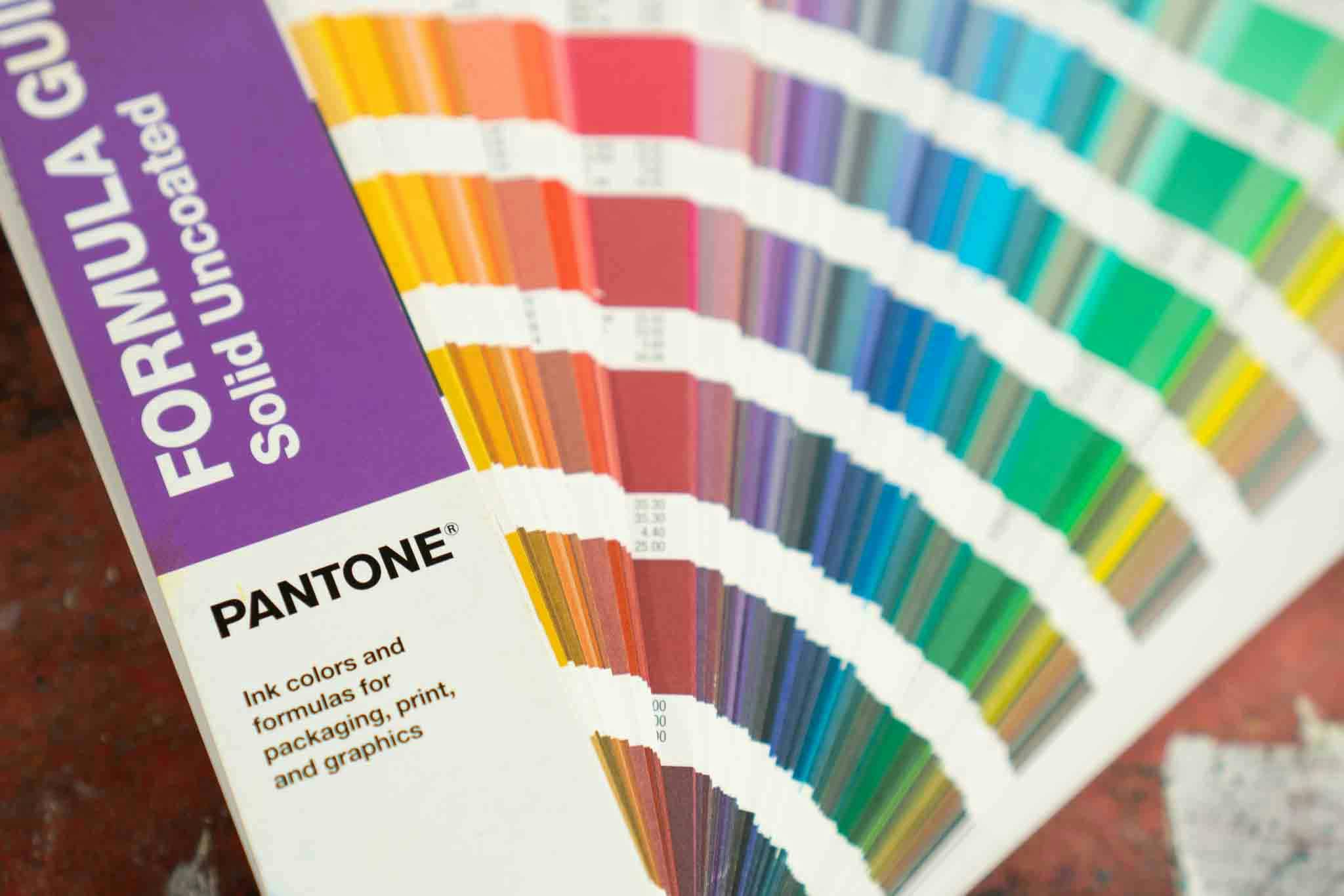
The Pantone Matching System (PMS) is the system most may have heard of. It’s mainly utilized for inks, printing, packaging, and digital artwork. For our purposes, PMS is generally what we’re working with, so communicating your intended color results in PMS shades will make the design process a breeze.
The Pantone Fashion, Home, & Interiors System is PMS’s fancy and more nuanced sibling. It’s best used for fabric, cosmetics, wall paints, and leather work.
Fun (and helpful) fact: If you ever have issues choosing a color or want to nail down an exact shade, Pantone also has an online color finder that can help.

How Pantone matching works in embroidery
Now get ready for the big reveal. The hardest process known to man: finding a color match for custom embroidery thread.
...Wait, the process is actually fairly easy? Ah, awkward 😅
Turns out, finding a Pantone color match with thread is pretty simple.
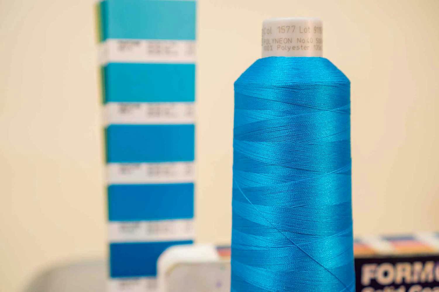
Utilizing a Pantone swatch book, our resident embroidery expert Walt eyeballs the shade needed and then gets more specific to find an exact match in Madeira thread.
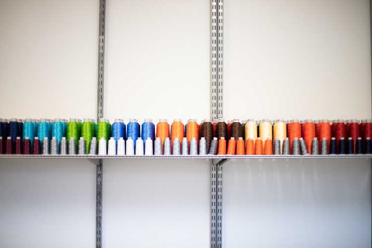
If we don’t already have the exact color match in house, we’ll order some and save the remaining thread for future potential orders. It’s as simple as that!
Embroidered orders tend to be a bit easier to color match than with ink in screen printing. Even still, when printing we can match any Solid Uncoated Pantone color. It can be tough to match exactly depending on the color and material of the fabric being printed on, but we'll get it as close as possible (which is, to say, pretty dang close).

Why Pantone?
We utilize Pantone and PMS guides because it’s one of—if not the—lead provider of color standards and color communication. One of our is "results matter"—which means that we believe anything worth doing is worth doing right. If we have high quality color matching then delivering a high quality product becomes that much easier.
Most people, brands, and organizations use exact Pantone matching across all platforms for consistency, because color is a key component in brand building and recognition. Imagine if the New England Patriots changed the shades of red and blue they wore every single game, or if their embroidered sweatshirts didn’t match their beanies… Kiiiiiiinda hard to have team pride without consistency, no?
Speaking of consistency—we want to be consistent in the results that we deliver to you, which is why having an agreed-upon color standard is convenient (and borderline critical).
Learn more
For more information on embroidery, product offerings, and more, visit our custom embroidery page.


