Designing With Pantone's Iconic 2021 Colors of the Year
A breakdown of Pantone's 2021 Colors of the Year—and how to use them effectively in design.
:quality(50))
The what, the why—and more importantly, the how-to:
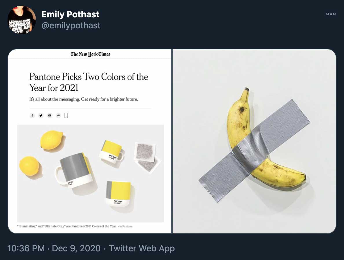
Earlier this month, Pantone announced that it had chosen not one, but two colors of the year for 2021: PANTONE 17-5104 Ultimate Gray and PANTONE 13-0647 Illuminating—an interesting combination of a familiar, homey gray and a vivid yellow that is reminiscent of sunny days, cold lemonade, and highlighters.
While the Pantone color of the year is traditionally intended to serve as a forecast of trends to come (as opposed to a summation of the year prior), we can’t help but feel that this year, the metaphor and meaning packs more of a punch than the actual color combination itself. After a particularly hard year in which we saw long-simmering social and political turmoil come to a head, a pandemic turn the entire planet upside down, and way too much of the inside of our houses, it seems that now no one is a stranger to the grayness of life—from the dull, to the melancholy, to the downright depressing. However, hope for the new year comes in the form of the bright yellow coming through—the eventual light at the end of the tunnel, the sun peeking through the clouds.
Some have poked fun at the color combo, with one Twitter user noting the resemblance between the pairing and Maurizio Cattelan’s viral sculpture of a banana stuck on the wall with duct tape, entitled Comedian:

Our take:
While the contrast between the colors may feel a bit jarring—even bordering on ridiculous—at first, we’re all about embracing the absurdity and the message, and riding this strangely monochromatic-yet-also-bright wave into the new year. It is, to put it plainly, “a mood,” and we’re here for it—having been taught by 2020 to find joy and comfort in even the most menial of life’s offerings, so that the mountaintop moments shine even brighter. To us, this color pairing speaks to balance and the power in unlikely combinations coming together to support one another. So... How does this translate into your custom t-shirt designs in the new year?
Designing with the 2021 Pantone colors:
Even beyond this year’s chosen pair of Ultimate Gray and Illuminating, the message of sharp color contrast (the meeting place of the dull and the vibrant) is a huge takeaway from Pantone’s selection, offering powerful insight into design trends in the year ahead.
A simple way to embrace this concept when designing your next piece of apparel is to opt for minimalism in design that allows your message to pack the real punch. Go for a basic, neutral-colored shirt with your message/logo/design in a bright pop of color.
If you want to really switch things up, flipping this color concept on its head is guaranteed to turn heads, catch eyes and start conversations. Consider playing around with a design that utilizes a bright, unconventional base color and a monochromatic print.
:quality(50))
:quality(50))
:quality(50))