Designing Custom Shirts With Pantone's 2018 Color of the Year
Ultra Violet was the Pantone color of the year! What it means, and how to design with it:

Every year Pantone, the world’s authority on color, releases the color that they think best represents the year to come. Their experts scour the globe in search for trends and patterns that they see, then pull together their findings to select one color that will define the year. What did they choose this year, and what does it mean in the world or design?
A quick scroll through Twitter might tell you that the general sentiment around the year ahead is something bleak –– like a midnight black or a drab brown. This year though, the team of color experts shared and talked through all their findings, and they landed on... Ultra Violet. Huh?

What Is Ultra Violet Supposed to Mean?
I’m willing to bet that a bright, vibrant purple is a color next to no one would have chosen. Given the polarization and divisiveness of the past year, why a color so ambiguous? Well, what we’ve learned from the Pantone Institute in the past is that they don’t necessarily pick the color that the world is as much as the color that the world needs.
It “communicates originality, ingenuity and visionary thinking,” Leatrice Eiseman, executive director of the Pantone Color Institute, says in Pantone’s release. “From exploring new technologies and the greater galaxy, to artistic expression and spiritual reflection, intuitive Ultra Violet lights the way to what is yet to come.”

This comes on the heels of 2017’s choice of Greenery, which Pantone said at the time provided “the reassurance we yearn for amid a tumultuous social and political environment.”
We love this step forward. If 2017 was a year of reassurance and healing, 2018 is a year of action, originality, and forward thinking.
Tips For Designing With Ultra Violet
To figure out how Ultra Violet translates to the design world, we asked Jen Capshaw, Lead Artist here at Real Thread, to share some tips on how to design using the Pantone’s Color of 2018:
An easy, but very impactful way you can use Pantone 18–3838 is by pairing it with different, bolder colors on the color wheel. Adobe Color is a great tool for creating color combinations.
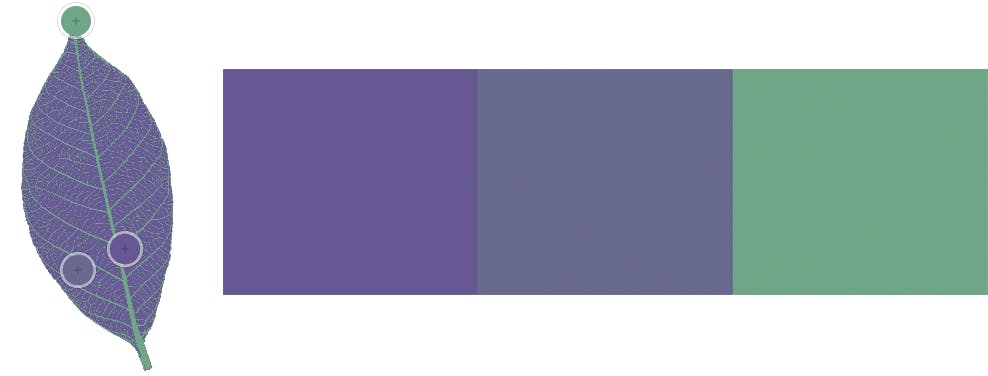
One great option is using analogous colors to give your design some interest. Analogous colors are colors that are next to each other on the color wheel. You can create a beautiful, uniform look to your design without going too overboard with colors:


Another great choice is to use triad colors. Triad colors are colors that are evenly spaced around the color wheel. They can give great color contrast and really make parts of your design pop. The trick with using triad colors is incorporating the pop of color in smaller details in the design. This will help make the design more impactful, but not overwhelming.

For more on different color types and how to apply them to design, check out our post on color theory.
5 T-Shirts That (Closely) Match Ultra Violet
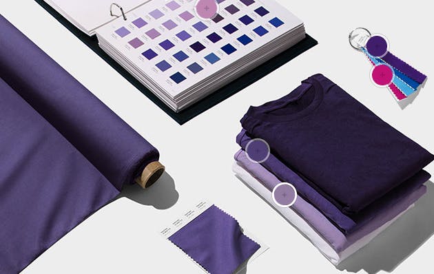
You have your tips on how to design with Ultra Violet, and if you’re looking for some t-shirts to match the shade, here are our top picks for t-shirts that closest match Pantone 18–3838 Ultra Violet:

Click on the links to get a closer view of the t-shirts and upload your designs on them with our easy mockup tool. Feel free to download the t-shirt templates as well, so you can start creating your next t-shirt design.


