Harnessing the Power of Color Psychology for Your Brand
Read all about one of the most studied (and controversial) elements of design: color psychology.
:quality(50))
The use of color and its psychological effects is one of the most studied, and most controversial, topics in branding and design.
It’s also massively important. In a marketplace where people are, consciously or unconsciously, making up their minds about brands in seconds, the colors that a brand deploys can be heavily influential in the decision a person makes.
In this post, we’ll look at why color psychology is important to you as a designer (of custom t-shirts or anything else) or marketer, and some general guidelines to follow when it comes to colors and the feelings/emotions associated with them.
Why color is important to your brand
Colors are incredibly important when it comes to marketing, branding, and design. It can influence where we look, how we perceive, and what we do once we see something.
Brands are in an ongoing battle to win the attention of customers, and the time they have to do it is getting shorter and shorter. Studies show that customers make their judgment on a product within 90 seconds of interaction with it, and about 62%-90% of that judgment is based on color.
Knowing the importance of color in decision making, it’s all the more reason to know how to use these colors and when.
Color is all about context
Here’s the thing about color science: it varies. Widely. As much as we’d love to tell you that there’s an exact science behind this stuff, there just isn’t. Too much of what certain colors mean to certain people is dependent on personal experience.
Don’t rely solely on color to convey your brand attributes — they don’t have the power to do that.
However, though colors don’t mean the same things to all people, there are common perceptions that each color shares towards a general audience, and in the context of your overall brand, the colors should feel perfectly at home.

Colors and their common perceptions
As we said, no one color is going to mean the same thing and feel the same way to everyone. But, each main color family does have certain associations with it that tend to project to a general audience.
Black — Mystery, power, sophistication
Black is a color associated with seriousness and mystery. At it’s best, it brings thoughts of sophistication and control, but it’s darker side can evoke thoughts of depression and even death.
Because of its sophisticated feel, black is used heavily in the high-fashion industry. It also works very well in scenarios where high contrast is needed, like if you need to make something legible.
Blue — Stability, harmony, trust
Blue is an incredibly popular choice of brand color — particularly in the corporate world. Emitting stability and trustworthiness, brands might lean this way if they really want to be seen as dependable, reliable.
Because so many brands default to blue as an easy, safe choice, it can be seen as boring, distant, and cold. But when used in conjunction with friendly, engaging brand assets, it blue will bring the perfect balance of interest and stability.
Brown — Earthy, comfort, security
Brown is a very natural color — wood, earth, stone, etc — giving it a very strong association with nature. Green does this as well, but with stronger ties to life and color. Brown is a bit more grounded, literally and figuratively, as it’s seen in nature in trunks in roots. This association gives it sentiments of balance, comfort, and support.
Green — Growth, health, envy
Like we noted earlier, green is commonly associated with nature, health, and growth. In nature, green most commonly seen in seasons of bloom and harvest, tying it strongly together with life, peace, and vibrancy. If your brand or product is somewhat tied to nature, you’d do well to incorporate some green into the brand.
Orange — Creativity, adventure, enthusiasm
Orange, a mix red and yellow, brings excitement and energy, as well as warmth and shelter. Studies have shown that the color orange can boost a sense of activity and stimulate brain activity. Maybe it’s no coincidence that three of the five marketing-related books on my desk right now heavily feature the color orange. Get active and productive in our Tultex 202 Fine Jersey T-Shirt, it looks great in orange!
Purple — Nobility, imagination, wisdom
Purple is a very regal color, but also has roots in imagination and spirituality. Being the mixture of red in blue, it shares equal characteristics of both, with the power and energy of red, and the stability and trust of blue.
It’s particularly easy to spot its association with nobility with its use in sports. The Sacramento Kings (regal), Orlando City Lions (kings of the jungle), and Minnesota Vikings (conquerors) all make heavy use of the color purple.
Red — Excitement, passion, danger
Red is a powerful color that’s commonly used to capture attention. Cite the girl in the red coat from Schindler’s List. It’s strongly associated with sentiments of excitement and energy. In short, red is a color that easily stands out.
Red can be powerful when employed on things like buttons, or calls to action — anything that demands attention. Depending on the context though, red can also portray aggression and anger. So, use wisely.
Yellow — Happiness, positivity, optimism
Yellow, drawing a lot of its color identity from the sun, is the epitome of happiness, positivity, and warmth. Because it’s color association is so strongly rooted in something this tangible, yellow’s psychological associations are very tangible.
Used with the right balance, yellow brings joy, happiness, and confidence. Too much, though, is known to make people hypercritical, bringing self-esteem and anxiety along with it.
Color Preferences by Gender
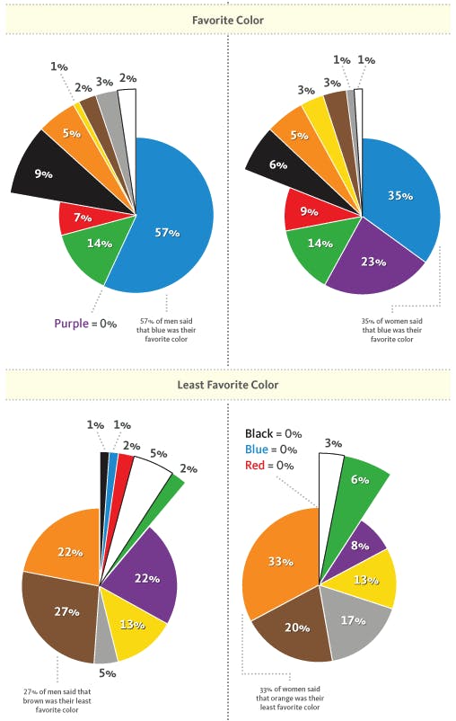
When it comes to color preferences, men and women have pretty different tastes. Not that the rules are hard and fast, but when it comes to gender, color preferences are pretty clear. Here’s a graph from Kissmetrics:

There are actually a lot of similarities in color preferences here. Notable takeaways being both genders' preference for blue, the huge disparity in preference for purple, and both genders' distaste of brown and orange (sorry, Cleveland).
Studies have also shown that tints, shades, and hues make a major difference in color preference. Women tend to prefer softer colors, while men are more inclined to choose bolder ones.
When it comes to brand colors, be descriptive
When considering colors for your brand or product, don’t be afraid to be specific and descriptive, as the name of the color itself will help influence perception. Want to make someone feel a certain way? Use words to help them get there.
Yellow = Sunshine
Blue = Ocean Blue
Orange = Citrus
Even these changes are relatively conservative. In elementary school, there was a Crayola crayon between yellow and orange and it was named “mac n’ cheese”. And guess what? There was a fight over that crayon every time!
Don’t be afraid to choose your color and own it.
Finding your color palette
Well, you may not have gotten any definitive answers about picking your color palette, but hey, that's the nature of colors.
And hopefully, you should be able to take this information and apply it to your color choice. Though there’s no 100% correct answer, informed decisions will yield better results, and we hope this information helps you make those decisions.
Have anything else our team can help with? Let us know! Our team would love to help you flash your brand colors on a set of t-shirts that’ll do justice to all of the hard work that went into choosing them.
:quality(50))
:quality(50))
:quality(50))