The "Why" Behind Our New Look
Join us as we walk into this new era of increased focus looking (and feeling) a little brighter 😎
:quality(50))
Today, we’re stoked to be going live with a Real Thread makeover that’s been in the works for the better part of a year now—good things, as they say, take time.
Since 2009, we’ve been giving other brands a wearable platform—a t-shirt that they can emblazon their logo on and wear proudly. We built a company that is rooted in trust, authenticity, and real relationships. We’re real-ly proud of that.
Over a decade later, we’ve been able to see—time and time again—that what we’ve always known really is true: quality matters. How it’s made matters.
As we started to sit with that awareness, we realized that we want the core of who Real Thread is to be more apparent when anyone stumbles onto our website, or across one of our boxes, or sees our logo on a t-shirt. We’ve been helping other brands tell their story for so long, that we kind of started to notice that we’d lost sight of how to tell our own story well.
So: to better reflect our growth, our values, and the beating heart that propels the business forward—and to convey what makes us different from the rest of the custom apparel industry—we felt like it was time for a refresh.
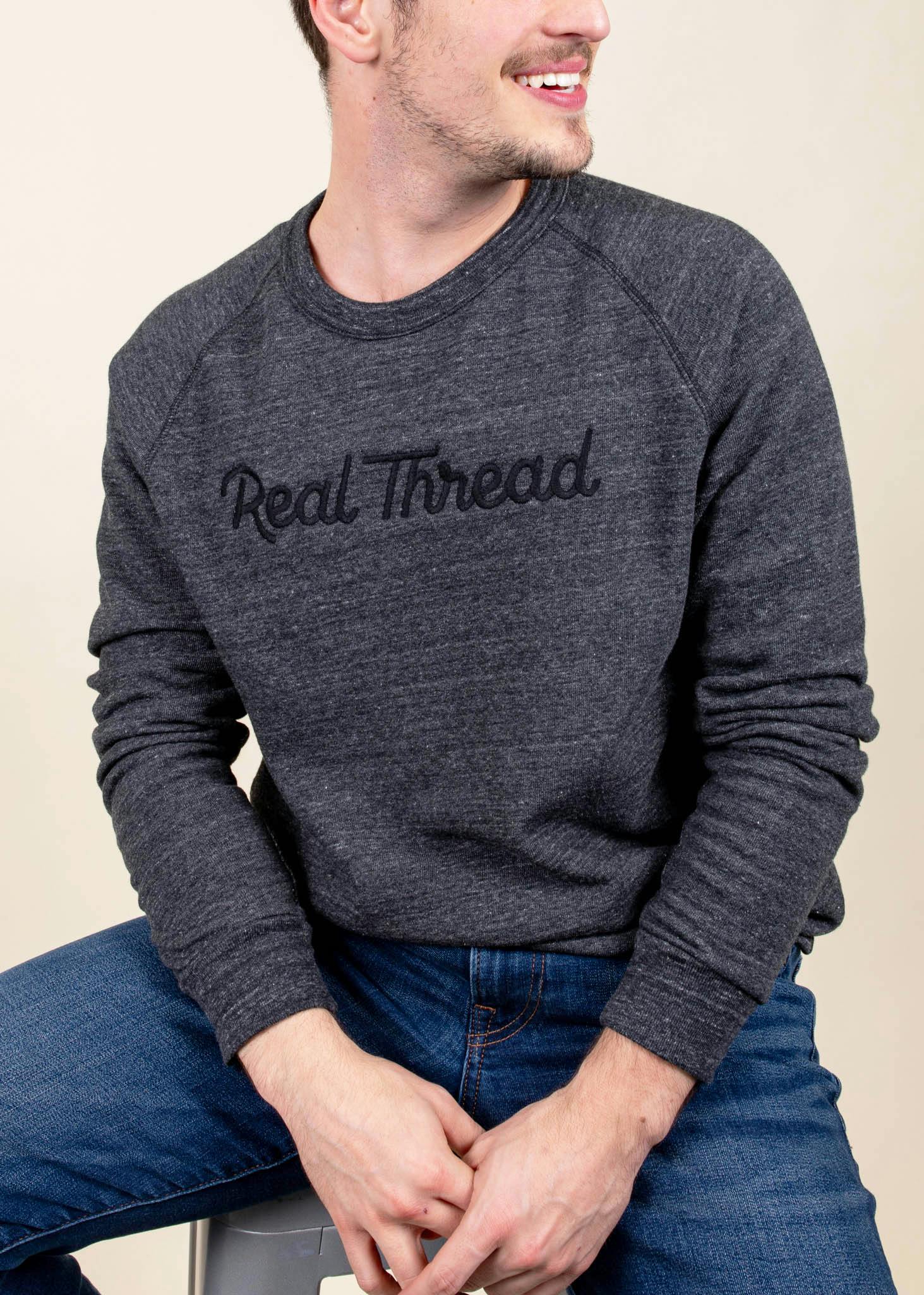
Why Rebrand?
Since the very beginning, we’ve known how make-or-break a good brand can be.
To those who knew it, the Real Thread brand was already pretty highbrow—especially compared to a lot of competitors within the custom apparel industry. But to those of us on the inside, it still felt like there was something missing.
We wanted a way to maintain the fun personality of the old Real Thread while also emphasizing some of the qualities that we felt were really core to the brand that weren’t shining through as much as we’d like: namely, our commitment to quality, service, and being a “force for good” in the apparel industry. Back in 2009, industry peers called us crazy for ditching the environmentally burdensome plastisol inks and in favor of our lighter treading (and feeling) water-based inks, but we've been committed to both high-quality printing AND sustainability from the beginning and have remained such.
In our initial rebrand strategy calls with our amazing partners Focus Lab, we started to really hone in on the idea of “returning” to the things that had always been true about Real Thread, but that had maybe gotten lost in the noise and hustle & bustle of becoming a capital-B Brand rather than a small-town local business.
Back to Basics
Real Thread’s origins are rooted in the idea of “elevated simplicity.” Our founder and fearless leader, Dru Dalton, was responsible for ordering shirts for his fraternity in college. Unsatisfied with the quality (and the unsustainable print methods that relied heavily on plastisol inks), he said “there’s gotta be a better way,” and here we are today. Through Dru’s research and passion, Real Thread became a pioneer in the water-based screen printing space, and thus became known for our super-soft shirts and eco-friendly processes.
“Profound and powerful things can also be simple.”What we knew for sure:
That we know who we are. we know who we are. We knew that we had a strong understanding internally of what we do, who we do it for, and why we do it the way that we do.
That our existing customers know who we are.our existing customers know who we are. Existing business is our bread-and-butter. Why? Because we develop lasting relationships with our customers and are genuinely passionate about bringing their designs to life in the best way possible. Generally, once someone works with us, they continue to do so for apparel projects long into the future.
That if we could just get new customers to give us a chance, we’d wow them.new customers to give us a chance, we’d wow them. We know that our commitment to quality and service set us apart from the pack—but we also know it's hard to know that until you really experience us.
What we were less sure of:
Who our actual “ideal” new customer was. We love everyone and just want to make every shirt in the world! But we also know that our methods, products, and quantities may not be the best choice for certain shirt-buyers.
What potential new customers in that category thought about us—or if they even knew about us at all.
How to make our differentiators feel real and tangible. We're confident in our differentiators, and that they've valuable, but how do we make our commitment to product/process quality and our hands-on customer service model feel practical and tangible enough to that audience that they would be willing to give us a shot?
Together, with Focus’ help, we started to gain more—well, focus.
We realized that we were unwilling to give up the things we felt most strongly about, and that in some ways, that would have huge ripple effects for the business. It would mean some hard “no”s and some “yes”es that would require time and intentionality—but we all agreed that it would be worth it.
We also realized that we couldn’t be everything to everyone—but that if we stopped trying to water ourselves down, we could be the very best for the audience that we serve. This means honing in on our core customer base of businesses and brands, and churches and non-profits, rather than entertaining the idea of moving into a “print-on-demand” model that moreso serves individuals and smaller groups.
Through research, hard conversations, and a lot of back and forth, we realized that we wanted our new brand to reflect that focus. So, this new brand will retain the commitment to excellence, proven quality, and consistency Real Thread is known for—but packaged in an elevated, authentic way that clearly articulates: how it’s made matters.
Defining “Quality”
Throughout the rebrand process, we kept coming back to a few core characteristics that we really wanted this new brand identity to exemplify. Time and time again, the biggest words that kept coming up were “trust,” “quality,” and “authenticity.” We kept coming back to the fact that we’re so humbled and honored to get the chance to come alongside brands and be a small part of their bigger story.
We kept locking in on this idea of:
“When you care about your brand, you care about the way you tell its story.”
…And we take great pride in being a trusted partner who works with our customers to bring their story to life in a way that we can all be proud of.
“Your brand matters. How you tell its story should too. Real Thread unites quality shirts with quality stories, told with care.”
We also wanted to communicate that every single person who works at Real Thread is part of something bigger than themselves, too—that the “how it’s made matters” mentality doesn’t only apply to our processes, but our people, too.
We kept running into this question though:
What does quality really mean? How do you take a word that’s become a bit of a buzzword and something that anyone can claim at surface level, and make it feel really… real? How do you communicate it in a way that feels genuine and tangible?
Our brand strategy, and the entire rebrand process (both visually and verbally) sought to answer that question.
Brand Strategy
Here's a peek into some of the details that make our new brand what it is.
Logo
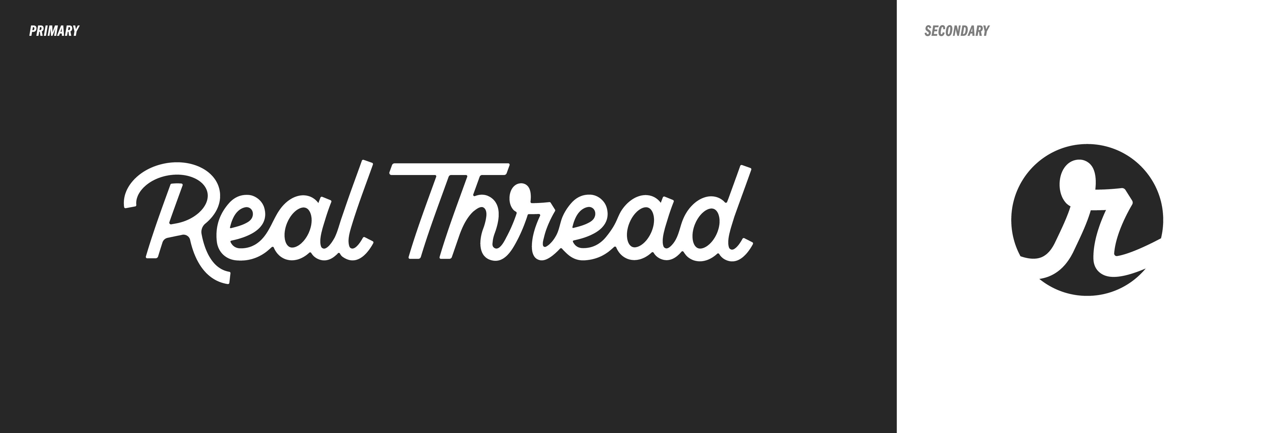
The logotype was inspired by a “common thread” concept—the idea that we’re all connected and part of something bigger than ourselves, and that t-shirts (as simple as they are) can be a tangible reminder of that connection to the bigger whole.
“We honor the common thread that pulls us together.”
Through our exploration with Focus Labs, we decided that a simple and handcrafted script felt like the best way to exemplify that concept—and speak to the idea of “elevated simplicity.”
Building on the attributes of the Real Thread brand, Focus created a secondary mark that conveys the common thread (it kind of looks like a thread with a loop when separated out from the rest of the logo) while putting visual emphasis on “real” by calling out the letter “r.”
Visual Language
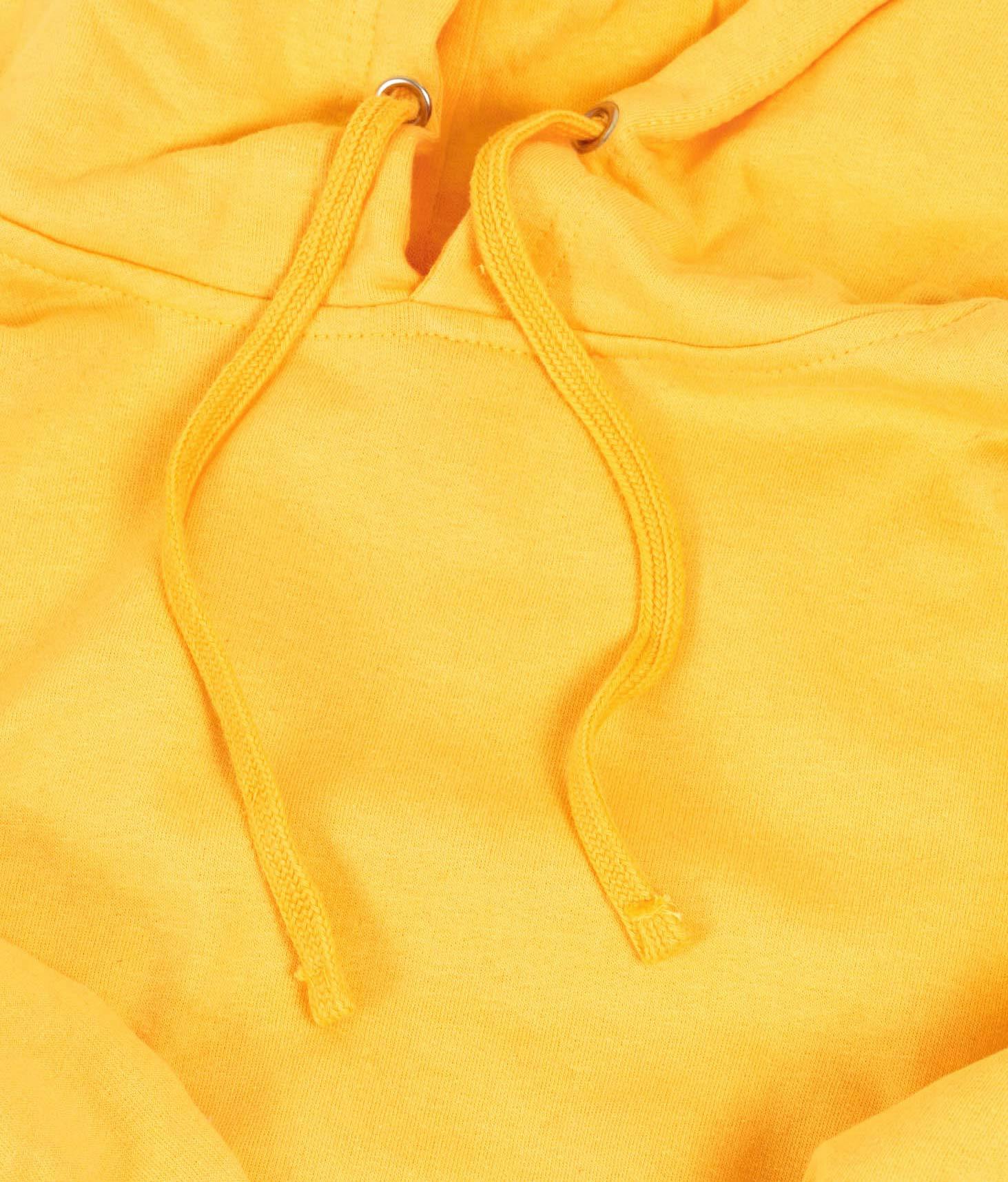
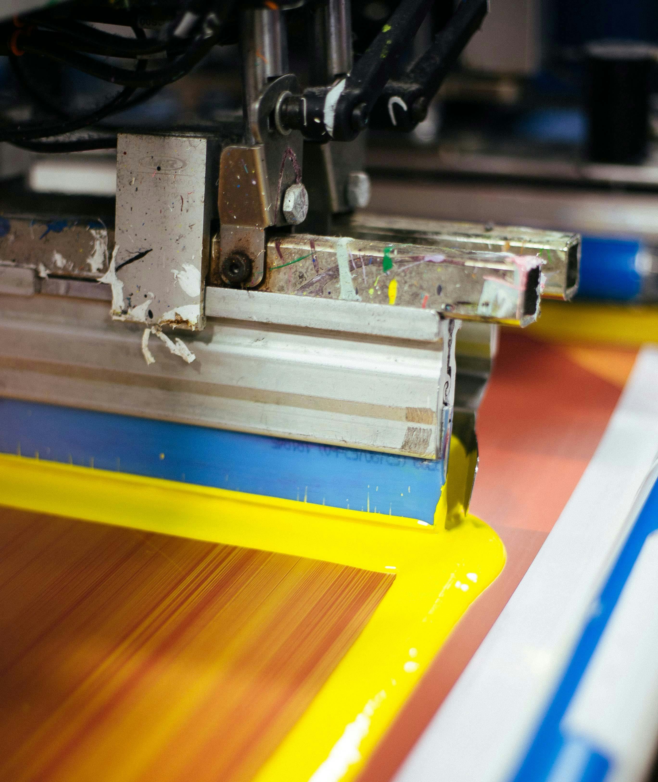
For the visual language, we worked with Focus’ talented designers to try to find a way to visually emphasize quality. After some exploration, we started to hone in on the idea of using the natural texture of fabric—especially using zoomed in, close-up shots of real garments—as a primary component of our new visual language. Another utilized texture is the squeegee: a reference to screen printing that balances clean lines with a suggestion of the messy behind the scenes. The clean, neat, and elegant look of the fabric texture combined with the messy, organic look of the squeegee/ink texture symbolized something that we feel is super representative of what we do: it’s gritty, but it’s also extremely artful, technical, and precise.
Color
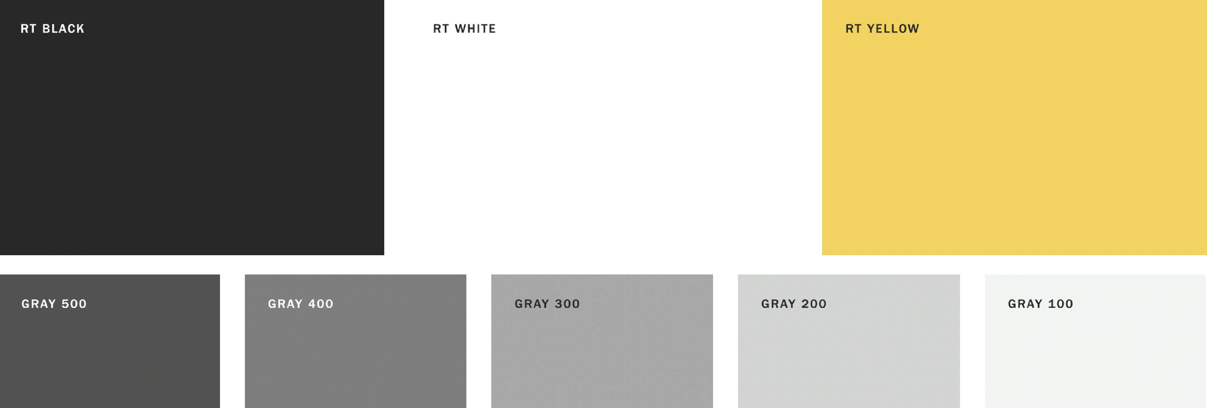
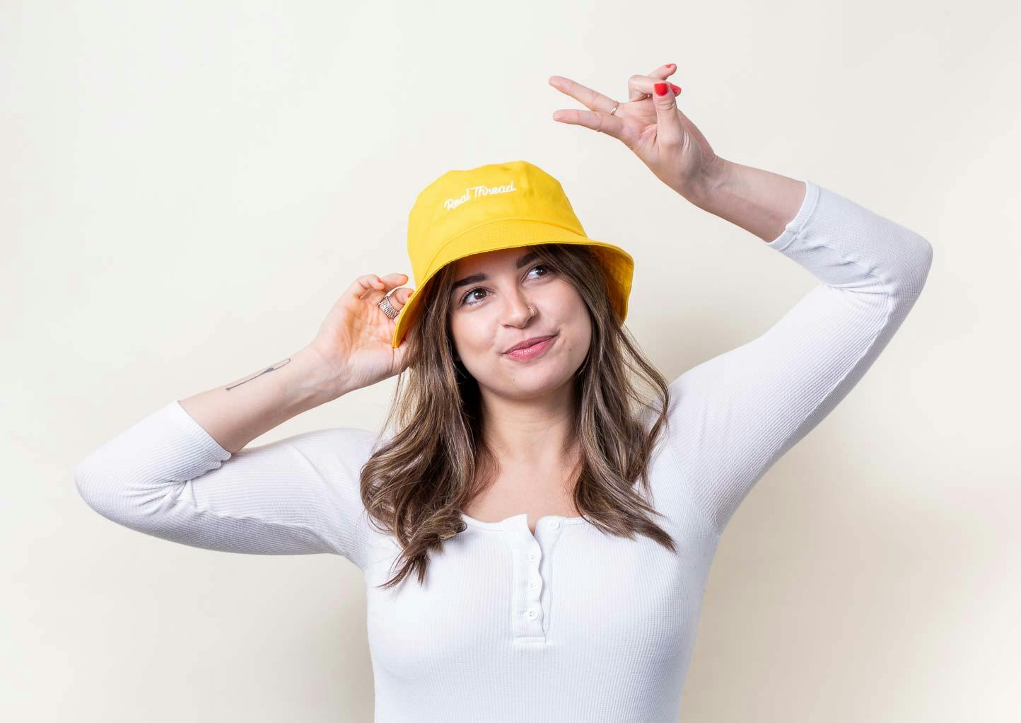
Real Thread's new color palette is limited: black, grays, and a signature yellow. Previously, we’ve had a very color-heavy brand (to play up the fun side of our identity)—but we’ve always felt like that ended up being a bit more restrictive than anything else.
We see hundreds of amazing, colorful, and unique designs come through every single week. One of the primary things we wanted to get out of a rebrand was the ability to share these designs freely, without worrying about things clashing or looking busy. A color palette that leans heavily on shades of black and gray gives us the freedom to lean into (and showcase!) the colors present in featured designs whenever we want:
The pop of yellow becomes our only real “brand color”—one that is used sparingly, but signifies the optimism, authenticity, and FUN inherent to Real Thread.
The Long and Short of It
This piece from our new brand story (a project we went through with the Focus Labs team that feels a bit like a more emotional/more involved elevator pitch) says what we want this rebrand to solidify, more than anything:
A passionate bunch who love making exceptional things, we’re not just toiling away on a line somewhere. We show up as friendly partners, here for the journey, avid about your vision, and always wearing our purpose on our [short] sleeves. With us, it’s not just about leaving your closet better than you found it. It’s about leaving the world better. Better working environments and practices and relationships. Doing the real work toward social and environmental change. Leading that charge. So go ahead, take a closer look: You’ll see our shared values, poured into every product. Our maker’s spirit, brought to every batch. We say looking good doesn’t have to come at the cost of doing good. If your story matters to you, share it in a way that will matter to the world.
So, hi: We’re Real Thread. Still.
We’re still about making super high-quality custom apparel. We’re still about doing so sustainably, and doing so with a “partnership mentality” that ensures quality and customer satisfaction. It’s still baked into our business model (and the very ethos of our brand) to go above and beyond for our customers.
What you can expect to hear more from us on, moving forward:
Sustainability (or the lack thereof) in the apparel industry—especially the custom apparel side
The “why” behind what we do and the way we do it
Why our water-based inks are superior (and the different types of water-based inks that we offer)
Information on the importance of the garments themselves (stay tuned for some fun updates on this front 😈)
Customer stories, case studies, and interviews that elevate our customers and increase their platforms
Other apparel items, outside of just t-shirts
Behind-the-scenes videos, pictures, stories, and more
So yeah, we look a little different now, and we like to think that we are a little different now, too.are a little different now, too. We feel like this rebrand, at its core, signifies a new era of Real Thread—one of increased focus and increased excellence. And we really hope you’ll join us as we walk into this new era, looking (and feeling) a little bit cooler 😎
Thanks,
The Real Thread crew

Side note: If you’re thinking about going through a rebrand yourself and have questions, feel free to reach out! We’d love to talk through what the process looked like so that you have more context before making a big decision. We highly recommend Focus Lab, though—they are an incredible team of highly-talented individuals who truly push the brands they are working with to be better. We’re big fans.
:quality(50))
:quality(50))
:quality(50))