Design Tips From Our Pros
These quick design tips will help your artwork look great and print even better.
:quality(50))
Want to make sure your custom merch looks just as good IRL as it does in your head? Our art team has your back.
Whether you’re DIY-ing your design or working with a designer, a few thoughtful steps can make a big difference in the final product. From avoiding last-minute snags to adding visual punch, here are some practical tips and creative ideas to help your merch turn out just right.
Practical Tips (For a Smoother Process)
1. Outline Your Fonts
Nothing slows down production like a missing font. If your design includes text, be sure to convert it to outlines before sending it over. That way, your font will show up exactly how you intended—no weird substitutions or formatting errors.
Here’s how:
In Illustrator: Select your text > Type > Create Outlines
In Photoshop: Select your text layer > Type > Convert to Shape
2. Use Coated Pantones
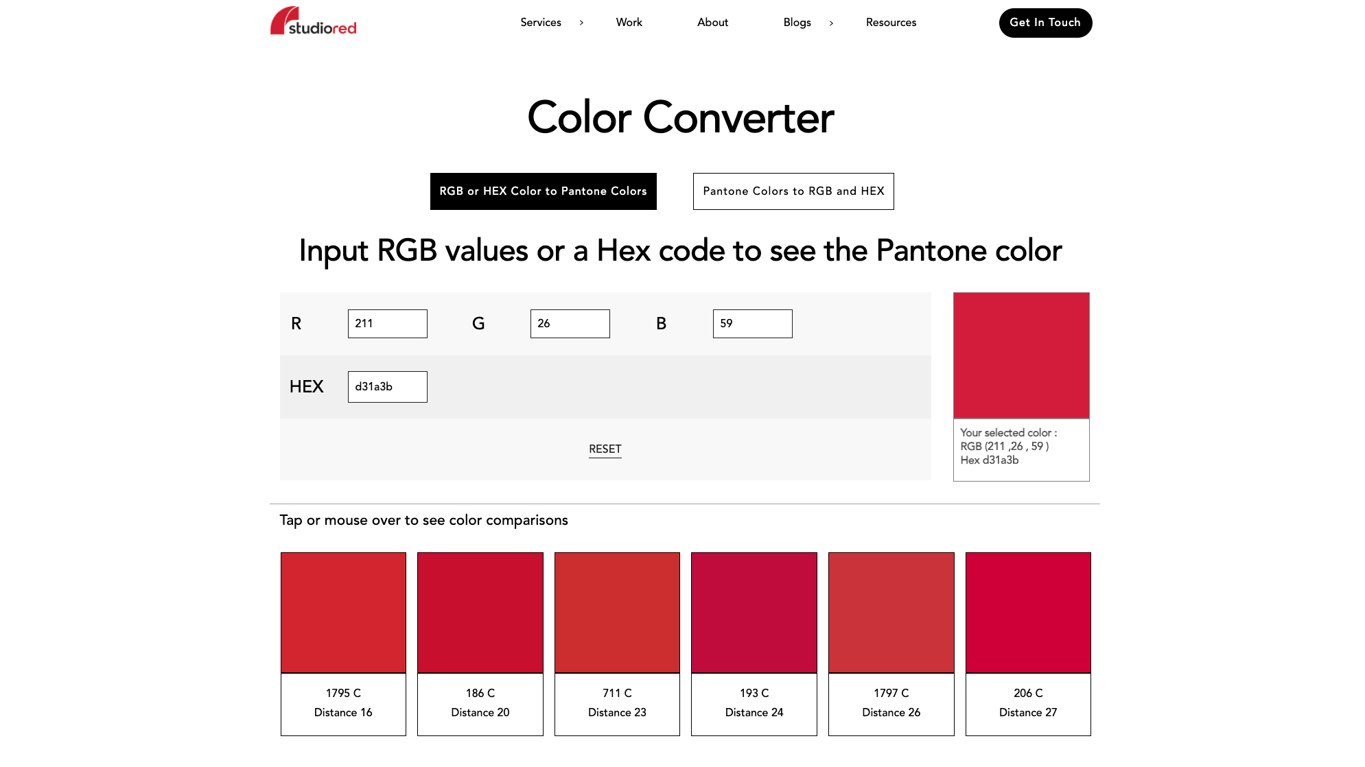
If you’re particular about color (and honestly, you should be), Coated Pantone values are your best friend. They help translate your digital design into printed reality with the most accuracy possible.
Don’t have access to Pantone books? No problem. Use a tool like StudioRed to convert your hex codes to their closest Pantone match.
Fun Design Tips (To Make It Look Incredible)3. Use the Shirt Color in Your Design
Let the garment do some of the work! Negative space is a powerful design tool—by allowing the shirt color to show through, you can reduce the number of ink colors used and create added dimension. It’s simple, effective, and often looks amazing.
4. Play with Texture
Looking for that soft, vintage, worn-in feel? A little texture can go a long way. Here are two ways to add it:
Inks: Use a tonal ink at around 50% opacity to get a faded look. This works especially well on triblend tees.
Design overlays: Incorporate a weathered or cracked texture into your art. You can find some great resources from RetroSupply Co. or check Adobe’s free options if you’re using Creative Cloud.
Minimalism wins when it comes to clarity and impact. Here’s how to stay on the right side of clean and cohesive:
Font count: Stick to two fonts max. More than that, and your design starts to feel muddled.
Color count: Aim for 3–4 ink colors for bold, legible prints. If your design is photo-realistic or super detailed, that’s a different story—but for most merch, less is more.
Purpose check: Make sure every element in your design supports the overall message or vibe. If it’s not adding something meaningful, consider leaving it out.
Pro Tip: We Review Every Design Before Print
Not totally sure about something? That’s what we’re here for.
Every order that comes through Real Thread gets a free design review, complete with high-resolution digital mockups, before you ever pay a dime. We’ll make sure your file is set up correctly, your design is optimized for printing, and everything’s good to go before it hits the press.
Have questions or want to run your idea by a pro? Just reach out—we’d love to help you make it perfect.


:quality(50))
:quality(50))
:quality(50))