Get a free custom-printed t-shirt with valid business email.
Claim your free sample →
phone
407-679-3895
forum
Contact a printing pro
forum
FAQs
person
Log in
/
Sign up
Start a quote +
Face Masks
Face Masks
Shirts
Short sleeve t-shirts
Long sleeve t-shirts
Pocket t-shirts
Ringer tees
V-neck t-shirts
Polo shirts
Made in the USA shirts
Eco-friendly shirts
Tie dye shirts
Women's t-shirts
Kids t-shirts
Tank tops
Unisex tanks
Women's tanks
Sweatshirts
Sweatshirts
Hoodies
Zip-up hoodies
Quarter zip sweatshirts
Women's sweatshirts
Kid's sweatshirts
Women’s
Women's t-shirts
Women's tank tops
Women's sweatshirts
Women's polo shirts
Youth & kids
Kids t-shirts
Hoodies
Kids sweatshirts & hoodies
Onsies (baby & toddler)
Jackets
Windbreaker jackets
Jean jackets
Hats
Baseball hats
Trucker hats
Bags
Tote bags
Duffle bags
Face Masks
Face Masks
Shirts
Short sleeve t-shirts
Long sleeve t-shirts
Pocket t-shirts
Ringer tees
V-neck t-shirts
Polo shirts
Made in the USA shirts
Eco-friendly shirts
Tie dye shirts
Women's t-shirts
Kids t-shirts
Tank tops
Unisex tanks
Women's tanks
Sweatshirts
Sweatshirts
Hoodies
Zip-up hoodies
Quarter zip sweatshirts
Women's sweatshirts
Kid's sweatshirts
Women’s
Women's t-shirts
Women's tank tops
Women's sweatshirts
Women's polo shirts
Youth & kids
Kids t-shirts
Hoodies
Kids sweatshirts & hoodies
Onsies (baby & toddler)
Jackets
Windbreaker jackets
Jean jackets
Hats
Baseball hats
Trucker hats
Bags
Tote bags
Duffle bags
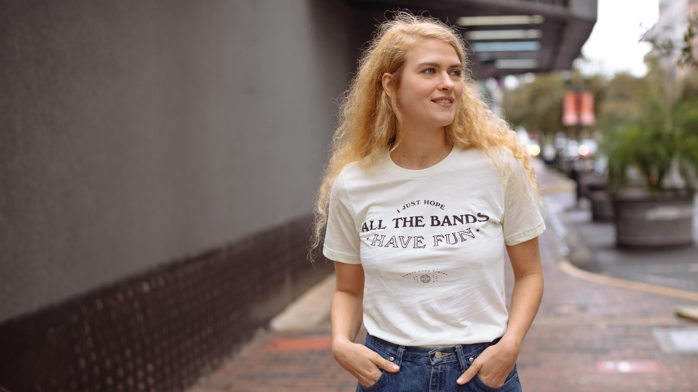
Los Angeles Apparel vs American Apparel
Learn the similarities and differences between Los Angeles Apparel and American Apparel.
Read more
Comparison
4
min read
Filter by Category
arrow_drop_down
All Posts
Comparison
Inspiration
Tips & Tricks
eCommerce
Design
T-Shirt Trends
Pima Cotton T-shirts Wholesale: What's the Appeal?
Learn the ins and outs of ordering Pima cotton t-shirts wholesale.
Inspiration
5
min read
Tultex vs Gildan
Learn the similarities and differences between Tultex and Gildan, two popular apparel wholesalers.
Comparison
4
min read
Tultex vs Next Level
Learn the similarities and differences between Tultex and Next Level Apparel.
Comparison
5
min read
Bella Canvas vs Gildan
Learn the similarities and differences between Bella Canvas and Gildan.
Comparison
5
min read
Bella Canvas vs Tultex
Learn the similarities and differences between Tultex and Bella Canvas.
Comparison
4
min read
Next Level vs Bella Canvas
Learn the similarities and differences between Next Level and Bella Canvas.
Comparison
5
min read
Comfort Colors vs Bella Canvas
Learn about the similarities and differences between Comfort Colors and Bella Canvas.
Comparison
4
min read
How to get LA Apparel 1801GD Wholesale
Learn the ins and outs of ordering custom LA Apparel 1801GD wholesale.
Inspiration
4
min read
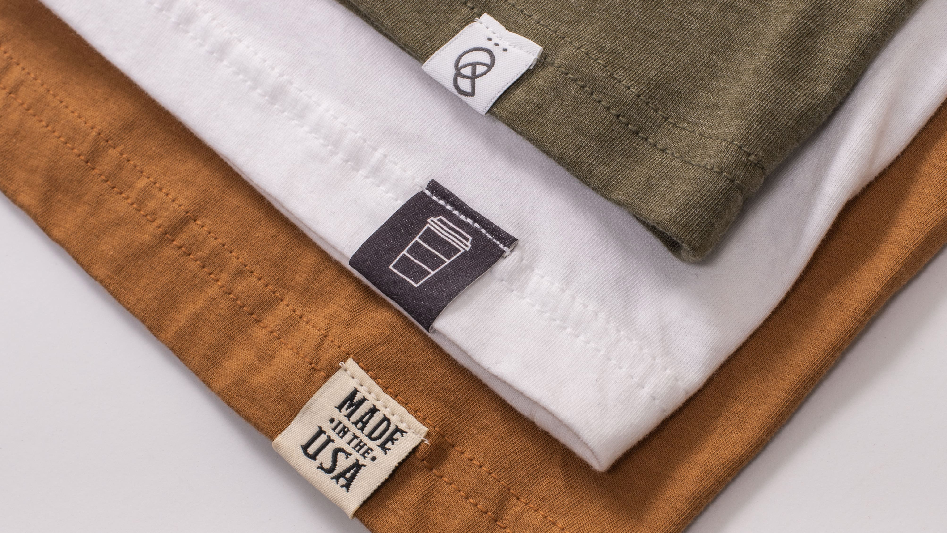
10 Ideas for Bulk T-Shirts With Custom Tags
Customize bulk t-shirts with custom tags to elevate your brand and captivate your audience.
Inspiration
5
min read
Ultimate Guide to Custom Allmade T-Shirts
Our comprehensive guide to custom Allmade t-shirts.
T-Shirt Trends
4
min read
Gildan vs Hanes: A Brand Comparison
Learn the similarities and differences between two beloved t-shirt brands, Gildan and Hanes.
Comparison
4
min read
How to Wash Clothes With Foil Print
How to properly wash clothes with foil print to preserve their shine and brilliance after washing.
Inspiration
4
min read
Next
Get our free Custom T-Shirt Buyer's Guide
A 25+ page how-to guide full of tips, tricks, and money-saving recommendations.
First name
Last name
Email address
Approximately how many custom shirts/hoodies/etc do you expect to order over the next 12 months?
Select quantity
0
1-19
20-49
50-99
100-199
200-499
500-999
1,000-9,999
10,000+
Thank you! Check your email, the guide is headed your way!
Oops! Something went wrong while submitting the form.
arrow_back
Products
add
How it Works
Fulfillment
Embroidery
Add-On Services
add
About
add
Templates
Support
add
Request samples
person
Log in
Our Products
Hats
T-Shirts
Tank Tops
Long Sleeves
Hoodies
All Products
Collections
Best Sellers
Men's/Unisex
Women's
Sustainable
Made in USA 🇺🇸
All Products
Brands
Alternative Apparel
American Apparel
Bella+Canvas
Next Level Apparel
Independent Trading Co.
All Brands
Add-on Services
Tag Printing
Hem Tags
Foil Printing
Metallic Ink
Fold & Polybagging
Hang Tags
Simulated Process Printing
Tonal Printing
Glow In The Dark
About
Company
Blog
Success Stories
Job Openings
Support
Contact
FAQs
Policies


.svg)